
Scoopful is here to
Make Life Sweeter
This family owned and operated ice cream store love sweets and making life sweeter
Making Life Sweeter
Since 1966
Scoopful is a conceptual, family-owned ice cream company based out of Northern Ohio. It fosters a nostalgic, family-friendly environment through its branding and commitment to its values of family, tradition, and community.
Typographically, Scoopful employs Ice Cream Slant as its decorative title font, often incorporating the melting ice cream motif for further variance within the display text. Ice Cream Slant is paired with Sofia Pro Soft as a widely versatile and highly legible body copy font with a wide range in weights and styles within the typeface.
The colors used are reminiscent of early 20th century marketing, utilizing a chocolate brown and vanilla yellow as the common background colors, a desaturated red-orange and navy make up the ribbon candy motif, and a lighter blue and pink create a check pattern evocative of the 1960s ice cream parlors popularized in cinema based in that time period.
First
Logo & Brand Design
The early stages of this project saw the creation of a brand. A history, family, and logo were all created for this brand. This established the overall flavor of this conceptual ice cream company.
Classic Logo, Modern Touch
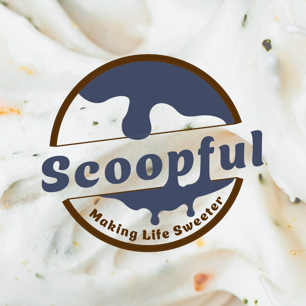
Scoopful’s primary logo is an emblem reminiscent of badge-style logos from the middle third of the 20th century.
temp image – logo & variations
New Flavors
Scoopful employs a 2-sided color theme. The light mode is a vanilla-yellow and dessert-pink, while the dark mode has a chocolate brown and sweet blue.
Second
Brochure
From writing short histories to naming a dozen ice cream flavors, to custom die line. All topped off with a seasonal insert and a unique flavor of design. This is where Scoopful’s design language was solidified, and motifs established.
Over a dozen
Sweet Flavors
An ice cream shop needs ice cream, right? Well Scoopful has over a dozen flavors, some on a seasonally rotating basis. Scoopful also has a rich history dating back to the 1960s
Sweet Design, Sweeter Story
Scoopful’s brochure uses a custom die line to show off the brand’s modern look. The brochure itself is a trifold gate design with a narrower outer panel, and a pocket for a seasonal insert.
Third
Packaging
The Scoopful brand has a range of ice cream related products. From scoops to sandwiches, to assorted toppings, Scoopful has everything ice you could imagine from a family-owned and operated company
Ice Cream Sammies
The Ice Cream Sammies, or ice cream sandwiches, are packaged in an 8 count box. The box itself is a standard box made to be stackable in stores and freezers, utilizing the ribbon and check motif to their best to separate content while simultaneously keeping everything connected.
Assorted Toppings
The assorted toppings package includes two pieces, the primary label and the supplemental top strip. The top strip is a strip going around the lid of the toppings, only having the blue and pink check pattern and further tying the design together. The main label is warped to accommodate a nonperfect cylinder container that is 1/8th inch shorter at the base than at the lip, and includes two windows allowing vision of all four toppings.
asdfasdfasdfasdfasdfasdfasdfasdfasdfasdf
Ice Cream Scoop
The ice cream scoop is a hanging package with a die line including zip tie holes to securely hold the utensil in place.
asdfasdfasdfasdfasdfasdfasdfasdfasdfasdf